“I have made this letter longer than usual, only because I have not had the time to make it shorter.”
— Blaise Pascal
Expressing an idea with few words is hard. It requires time and effort.
When it comes to infographics, trying to condense all the information you have into text and design calls for artistic balance.
A few elements of text should be more than enough to tell a predominately visual story. But text on an infographic is like salt in a cake — it enhances the flavours of the other ingredients.
When do we add the salt? Is a pinch enough or do we need a sprinkle? And what other ingredients do we need to bring out the full flavour?
To answer these questions, we’ve had the pleasure of picking the brains of two experts: Marta Olszewska, Head of Marketing at Piktochart and Nick Routley, Creative Director at Visual Capitalist.
Define the theme and angle of the infographic
The objective of an infographic is to transform complex ideas into simple stories that inspire and educate.
Think of an infographic as an informative voyage you take your audience on. Before embarking on the journey, ask yourself: where do you want to take them and which pit stops will you be making along the way?
The objective of an infographic is to transform complex ideas into simple stories that inspire and educate.Click To TweetThese then trigger the following questions: What is the story? Which point of view should you tell it from? The theme and angle of an infographic are the first two aspects you must decide on as these will guide the storytelling and your content writing.
“The biggest task when you’re creating an infographic is actually to understand the core of your topic, choosing what is absolutely essential and then brainstorming possible angles for visualising it.
Would a comparison work? Could it be represented with a timeline? What kind of icons or imagery would you use to emphasize on your main message? What colour scheme would work in relation to your topic?
After this part is done and you have a comprehensive storyboard in your mind (or on a piece of paper), you can start complimenting your visual elements with text.”
— Marta Olszewska, Head of Marketing at Piktochart
A single theme can be tackled from various angles and in many cases, it is the chosen angle of the story that determines the originality of the piece and in a way dictates the amount of interest generated.
For example, much has already been said and done about social media networks and their sizes. But conceptualising it as a “universe of social networks” and applying a spatial theme to it makes it unique.
Extra points if you make use of the time factor. Using the latest data and information gives your infographic much-needed relevance. And this is exactly how the creative team at Visual Capitalist came up with this infographic.
“While we were in the planning process of that infographic, I was experimenting with ways we could compare the size of the various networks. The combination of the scale of Facebook’s user base (2.2 BILLION people?! A non-trivial portion of the human population), and the circular data viz we were experimenting with, is what led to the idea.
Also, a space/planet theme is a lot of fun to create a piece around, and we don’t always have an opportunity to go all-out on an analogy like that.”
— Nick Routley, Creative Director at Visual Capitalist
Be concise
The most-shared infographics have, on average, between 227 and 230 words. And this tells us a few key rules about texts on infographics:
- Visual elements should dominate.
- Texts should serve to direct attention to the main elements of the infographic. It should not distract.
In fact, the beauty of an infographic’s content lies in the variety of presentation formats available. Here is what Marta considers when deciding to add text:
“Can I actually do without it? Can I visualise what I want to say with icons, charts, or images?”
When there’s not much room for manoeuvre, simplicity reigns, which brings us to the third rule:
3. The more concise and specific the text, the better.
This is a classic copywriting tip for any content marketing team. The idea is to optimise the balance of message transmission and space consumption.
In copywriting, a generic sentence serves no purpose. In an infographic, it serves only to take up what limited space you already have.
Start strong
The perfect infographic title is short, impactful, and catches your attention right off the bat. According to Nick, it’s important to not delve too much into the details.
“Titles should usually be something short and snappy, but beware getting too far into the weeds when coming up with ideas. Ideally, the viewer will know exactly what the piece is about. Bonus points if you can work a clever analogy or pun into it, but forcing it is almost always a bad idea.”
Once you have relayed the core message of the infographic, you can use a more suggestive subtitle to introduce the story and pique curiosity. A quick introduction can also provide context and highlight the main message of the infographic.
“I often use an essay writing approach to thinking about copy for infographics. What’s the thesis or problem? You’ll want to set the scene right from the outset.”
— Nick Routley
The key is for these elements to encapsulate the infographic’s value proposal and answer the one question we all ask before consuming a piece of content:
— “What’s in it for me?”
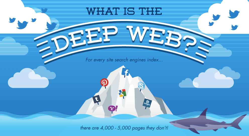
In this infographic by Dashburst, the title is simple, direct, and grabs our attention immediately by introducing an astounding and eye-opening statistic: For every site search engines index, there are 4,000 to 5,000 pages they don’t!
There will, however, be certain topics are more challenging to express visually and will require more words to make sure the message gets across. One such example is this infographic by Marketo.
Few but powerful words
Most infographics are not meant as a direct sales tool but rather a medium to inspire, persuade, or inform. To do that, they must be able to capture and hold the attention of the consumer.
This is where power words come into play. Create a list of words that evoke emotions and values associated with the theme of the infographic.
Consider an infographic on elderly care directed at family caregivers.
Care, protection, risk, health, help, loneliness, disability, disease, well-being, etc. These are words that help you better connect with your audience as it triggers the emotions and highlights the values they feel as a caregiver.
Most infographics are not meant as a direct sales tool but rather a medium to inspire, persuade, or inform. Click To TweetPlay around with the theme
“The overall theme of the piece is a big influence on the copy you’ll end up using in the piece.”
— Nick Routley
Words that enhance the theme or the visual style of the infographic adds personality and coherence. And this is easier to apply when there’s a clear and original angle.
Let’s revisit the infographic on the universe of social media.
After presenting the infographic’s value proposition — why the information presented is important and what to expect from it — we see a tiny spacecraft with a copy inspired by the galactic theme inviting us to view on: Let’s go exploring!
Plus, notice how the three blocks of text are organised: from left to right and descending, directing the narration and taking us directly to the ship and CTA.
Balance the visual impact of text with design
Having two sentences back to back may be too overwhelming. One way to include more information without saturating the infographic is to balance the visual weight of the texts with the design.
Here are five key tips from Marta:
- Make sure there’s space around your text and other elements. Whitespace is what matters the most.
- If you do need to add text, think of short paragraphs that focus on the core of your message.
- Highlight the most important text using bolding, a different colour, or increasing letter spacing.
- Use font hierarchy to differentiate between headers and descriptions. Be consistent and do not use more than two to three font sizes.
- Use icons coupled with bold typography to draw attention to your key points. This works well for statistics. Like this.
Now, this infographic by Zabisco includes a ton of text. But it makes the most of the hierarchy of fonts, sizes and colours to order, contrast and visually separate the elements.
Put data into perspective
The design of the infographic is what guides the audience’s journey through the numbers and data. But the accompanying text also has a supporting role to play. More specifically, it caps the story and holds attention.
A classic copywriting tip that helps to make information more interesting and easy to digest is to put it in perspective by adopting references that the audience understands.
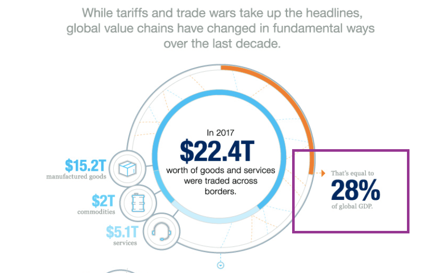
For example, repackaging an absolute number into a percentage of another value, as done here by Visual Capitalist.
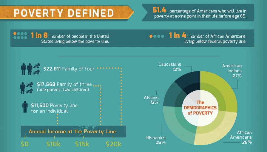
Depending on the context, another way to do this would be to convert a number into a more manageable figure such as a fraction: 1 in 8 people is so much easier to visualise than 12.5%.
Plus, it’s also way more impactful. 1 out of every 8 people in the US live below the poverty line? That could easily be you.
The best thing about fractions is that you can present it as text, as a pictogram, or even as a combination of both.
When dealing with statistics, Marta recommends going beyond a regular bar or pie chart with long descriptions and use icon metrics for visualisation instead.
Another way to introduce perspective to numbers is with an equation.
Think about the figure $200 million. This number is so beyond the average person’s reach that it’s difficult to comprehend its value.
One way to bridge that gap would be to associate it with something that’s more relevant. For example, $200 million can be presented as:
- 800 times the average cost of raising a child in the US until he/she begins university
- Just $60 million shy of the cost of the lowest-priced Boeing 777 model
Complete the story the data tells
Infographics tend to be more effective when the text and graphic elements complement each other. In Nick’s own words,
“Graphics are often better at conveying data and setting the mood, and text is usually better at creating context or adding colour commentary.
A simple example of this would be an annotated stock chart. The chart sort of speaks for itself, but text points are useful for pointing out events that may have occurred or explaining the big picture of why the data is doing what it’s doing.”
Here’s a great example by Anthropocene.
Boost your infographic’s SEO
If the objective of the infographic is to generate traffic, its content should be optimised for search engines. That starts with doing the proper keyword research.
“What questions do people ask in relation to your topic and what is their intent?”
For Marta, the focus is on search intent and she recommends using tools such as Ahrefs to get a full list of related question-based searches.
“You can use them in the title of your infographic or its different sections. If you’re describing a step-by-step, spell out all the different steps. Structuring your content like this might help you get to the rich snippets and Google’s ‘position 0’.”
For SEO purposes, important statistics represented by graphics should also be included as text. Besides summarising the most important statistics into text, you can also add text density and keywords.
An extra bonus: Presenting them in HTML allows for easy copying and pasting, which facilitates the sharing of this data on social media alongside your URL!
For SEO purposes, statistics represented by graphics should be included as text. Click To TweetDon’t forget to hop on over to our blog for more content writing tips!
Lin’s an ex-journalist who’s found her new love in content marketing. In her spare time, she’s on a secret conquest to find a solution to never having to cut her nails again.


